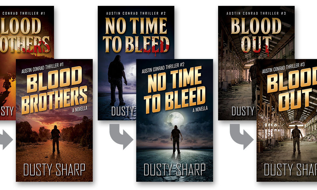
If you’ve been with me for a while you might have noticed some recent changes to my book covers. Over the summer I chipped away at overhauling the look of the entire series, in anticipation of some future developments. They say perfect is the enemy of good, but after endless tweaking I think I finally got them where I think they’re good, if not perfect.
The original covers for the Austin Conrad series started with No Time To Bleed (which you OG’s will remember was the first book I published, though it ended up being Book 2 in the series). That was the first book cover I ever designed, and the next two books just sort of carried over the same concept. And while it served its purpose at the time, I’ve since learned a few things about cover design and book marketing, so I thought a refresh was in order.

There were three main goals I had in the redesign. First was to fit better into my genre niche. Not that I’m exactly sure what my niche is yet, but I’m reasonably sure it sits somewhere in between Pulp Thrillers and Vigilante Justice. The main design element that I felt was missing the mark was the title typography, which looked a bit old-fashioned. I didn’t want something ultra-modern like we see on psychological thrillers, or too edgy like on espionage thrillers. So I thought a bold but narrow sans-serif font would work well. I gave it a skew to create some motion, and I think it turned out nice. I think it puts the “pulp” in Pulp Thrillers!

The second order of business was the image for Blood Brothers (Book 1). I got lazy when I designed the original cover for that one, because it was only supposed to be a short story I gave away for free to attract new readers. So I just used a stock photo I found, depicting some motorcyclists on the road, with a couple of color tweaks. But that never looked quite right to me, as it didn’t follow any of the cues from the other book covers. So I shit-canned it and started over with that one.

The third issue was that I wanted to maintain branding across the series, from book to book. So I re-did the background images for each of them, by placing them all in the same template. I actually have them all in the same Photoshop file, with each image in its own layer group, so I could unify the horizon lines for all of them. And the central figure (my buddy Cam Berry posing as Austin Conrad) is actually the same image dropped into each different background. I thought the result looked pretty good, especially when seeing each of the cover side by side.

One more small issue I addressed was to remove the motorcycles from the cover. For Blood Out, they went away when I scrapped the entire image I had been using. But I also had a bike in the background on the No Time To Bleed cover, which I removed during the overhaul. The reason I’ve done this is I’ve learned that motorcycles and motorcycle clubs come with their own negative reactions among readers. I think it turns them off before they even give the books a try. But to be truthful, these books aren’t really about the motorcycles or the club. Those are just the background noise. These are still taut, fast-paced, action-packed thrillers, that most fans of the genre would appreciate. So I removed the motorcycles as a handicap to first impressions.

During the redesign I also incorporated the template into the audiobook covers as well as a couple of additional titles. One is a short story that will be bundled with a box set of the first three books, and the other is a new cover for the box set itself. I’ll reveal both of those as each project progresses.
Please let me know what you think of the new covers!
The new covers look great. Too bad they are not able to be put to already owned books as upgrades. Of course they could be with some specialty programs. But that would not be a good thing for you and could possibly be against the law.
Am waiting for the next book in the series.
I think they reflect the stories inside better than the original ones. Lookin Good!